Case (![[personal profile]](https://www.dreamwidth.org/img/silk/identity/user.png) case) wrote in
case) wrote in ![[community profile]](https://www.dreamwidth.org/img/silk/identity/community.png) fandomsecrets2026-05-23 02:05 pm
fandomsecrets2026-05-23 02:05 pm
[ SECRET POST #7078 ]
⌈ Secret Post #7078 ⌋
Warning: Some secrets are NOT worksafe and may contain SPOILERS.
01.
__________________________________________________
02.

__________________________________________________
03.

__________________________________________________
04.

__________________________________________________
05.
__________________________________________________
06.

__________________________________________________
07.

Notes:
Secrets Left to Post: 02 pages, 39 secrets from Secret Submission Post #1011.
Secrets Not Posted: [ 0 - broken links ], [ 0 - not!secrets ], [ 0 - not!fandom ], [ 0 - too big ], [ 0 - repeat ].
Current Secret Submissions Post: here.
Suggestions, comments, and concerns should go here.
no subject
Transcript by OP
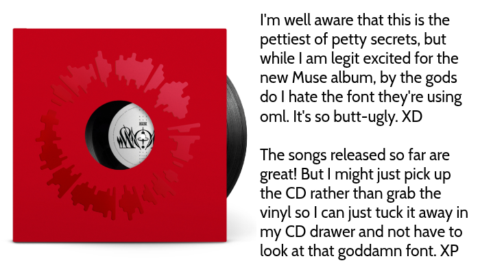
The songs released so far are great! But I might just pick up the CD rather than grab the vinyl so I can just tuck it away in my CD drawer and not have to look at that goddamn font. XP
Re: Transcript by OP
(Anonymous) 2026-05-23 10:16 pm (UTC)(link)But yeah, ugly font or no, I too am looking forward to the new album.
no subject
(Anonymous) 2026-05-24 12:18 am (UTC)(link)no subject
Oh, hush.
Or describe what you think is actually a mental health issue here.
no subject
(Anonymous) 2026-05-24 02:29 am (UTC)(link)Or is this that anon that just goes around posting the same "seek therapy" comments to whtever?
no subject
(Anonymous) 2026-05-24 12:22 am (UTC)(link)no subject
(Anonymous) 2026-05-24 02:30 am (UTC)(link)But i'm more curious about your cd drawer. Is that literal?
no subject
(Anonymous) 2026-05-24 03:01 am (UTC)(link)I'm curious though, how do you store your records? I would think it'd be easier to hide a records image than a CDs? Unless the CD has a different picture?
no subject
(Anonymous) 2026-05-24 03:31 am (UTC)(link)no subject
(Anonymous) 2026-05-24 04:05 am (UTC)(link)