Case (![[personal profile]](https://www.dreamwidth.org/img/silk/identity/user.png) case) wrote in
case) wrote in ![[community profile]](https://www.dreamwidth.org/img/silk/identity/community.png) fandomsecrets2018-11-22 08:07 pm
fandomsecrets2018-11-22 08:07 pm
[ SECRET POST #4341 ]
⌈ Secret Post #4341 ⌋
Warning: Some secrets are NOT worksafe and may contain SPOILERS.
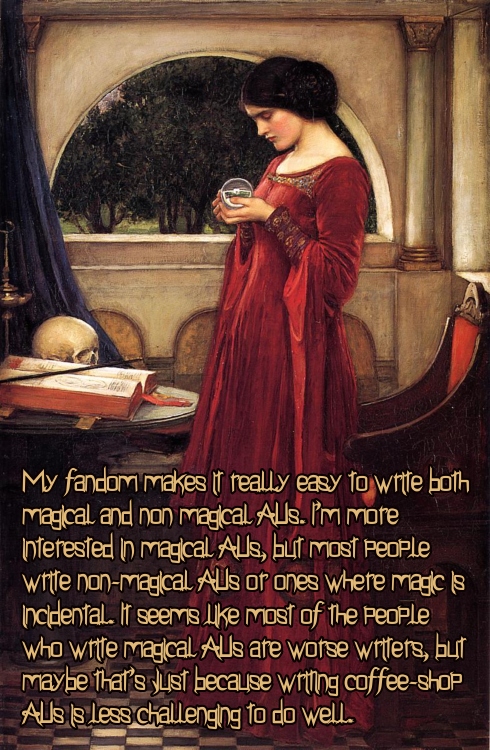
01.

__________________________________________________
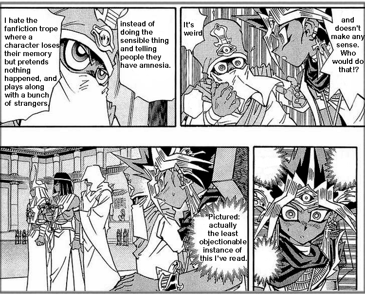
02.
__________________________________________________
03.

[Roman Empire: Master of Rome - Jessica Green as Cleopatra]
__________________________________________________
04.

(Martin Freeman in the Vodafone adverts)
__________________________________________________
05.

[Barbie Collector Fandom]
__________________________________________________
06.
__________________________________________________
07.

[Stan Lee]
__________________________________________________
08.

[She-Ra]
__________________________________________________
09.

Notes:
Secrets Left to Post: 01 pages, 09 secrets from Secret Submission Post #621.
Secrets Not Posted: [ 0 - broken links ], [ 0 - not!secrets ], [ 0 - not!fandom ], [ 0 - too big ], [ 0 - repeat ].
Current Secret Submissions Post: here.
Suggestions, comments, and concerns should go here.
no subject
[She-Ra]
no subject
(Anonymous) 2018-11-23 01:22 am (UTC)(link)no subject
(Anonymous) 2018-11-23 01:26 am (UTC)(link)no subject
(Anonymous) 2018-11-23 01:28 am (UTC)(link)no subject
(Anonymous) 2018-11-23 01:27 am (UTC)(link)no subject
(Anonymous) 2018-11-23 01:31 am (UTC)(link)I am so sick of googly looking anime eyes and round faces.
no subject
(Anonymous) 2018-11-23 02:35 am (UTC)(link)no subject
Said backgrounds aren't jumping and fighting, yes, but the characters really stick out. Otherwise, I enjoy their designs (I love Mermista and Entrapta) and the story.
no subject
(Anonymous) 2018-11-23 03:18 am (UTC)(link)you see this contrast in a lot of places, even the original tintin comics: very stylized faces/people. much more realistic or detailed backgrounds and objects
no subject
I love sleek Hordak though.
My "Fuck this art style. Not watching" reboot is Thundercats.
no subject
(Anonymous) 2018-11-23 01:35 am (UTC)(link)no subject
I will say that the new show's character models are relatively simple while the backgrounds are gorgeous, but I wonder if that's for ease of making the show(getting it done faster and what-not so it can be produced to a tighter schedule, but I really don't know so this is just conjecture on my part).
And tbh I really like a lot of the designs for the characters even if they are simple, Catra being a fave since I'm always a sucker for cat-girls.
no subject
(Anonymous) 2018-11-23 01:38 am (UTC)(link)no subject
(Anonymous) 2018-11-23 01:46 am (UTC)(link)no subject
(Anonymous) 2018-11-23 01:50 am (UTC)(link)(no subject)
(Anonymous) - 2018-11-23 02:01 (UTC) - Expand(no subject)
(Anonymous) - 2018-11-23 02:58 (UTC) - Expand(no subject)
(Anonymous) - 2018-11-23 03:21 (UTC) - Expand(no subject)
(Anonymous) - 2018-11-23 02:02 (UTC) - Expand(no subject)
(Anonymous) - 2018-11-23 03:01 (UTC) - Expand(no subject)
(Anonymous) - 2018-11-23 03:37 (UTC) - Expand(no subject)
(Anonymous) - 2018-11-23 06:07 (UTC) - Expand(no subject)
(Anonymous) - 2018-11-23 11:26 (UTC) - Expand(no subject)
(no subject)
(Anonymous) - 2018-11-23 05:26 (UTC) - Expand(no subject)
(Anonymous) - 2018-11-23 02:36 (UTC) - Expandno subject
(Anonymous) 2018-11-23 01:52 am (UTC)(link)(no subject)
(Anonymous) - 2018-11-23 01:55 (UTC) - Expand(no subject)
(Anonymous) - 2018-11-23 02:01 (UTC) - Expand(no subject)
(Anonymous) - 2018-11-23 02:37 (UTC) - Expand(no subject)
(Anonymous) - 2018-11-23 02:52 (UTC) - Expandno subject
(Anonymous) 2018-11-23 02:33 am (UTC)(link)It's too bad because the original She-Ra was my childhood and I was psyched for a remake, but the art is just so ugly and off-putting that I have zero interest in watching it.
(no subject)
(Anonymous) - 2018-11-23 02:38 (UTC) - Expandno subject
(Anonymous) 2018-11-23 02:43 am (UTC)(link)Also they all looked like adults despite being teens in the old show. And yes, they were teens! It's creepy to me how sexualized the old version is when she was, like, 16~. Like. She looked in her twenties to thirties. I can't stand that!
(no subject)
(Anonymous) - 2018-11-23 03:15 (UTC) - Expand(no subject)
(Anonymous) - 2018-11-23 13:40 (UTC) - Expandno subject
(Anonymous) 2018-11-23 03:22 am (UTC)(link)no subject
(Anonymous) 2018-11-23 03:40 am (UTC)(link)no subject
(Anonymous) 2018-11-23 03:52 am (UTC)(link)That said, I didn't love the new designs for Shadowweaver or Perfuma, and Angela is bugging me some too. Hordak is MUCH better though, and overall, the new one is a far superior production.
(no subject)
(Anonymous) - 2018-11-23 06:10 (UTC) - Expandno subject
(Anonymous) 2018-11-23 02:16 pm (UTC)(link)But I really wish this "undercut/sidecut" hairstyle trend would die already. It's been overdone to death.
no subject
(Anonymous) 2018-11-23 03:52 pm (UTC)(link)(no subject)
(Anonymous) - 2018-11-23 19:52 (UTC) - Expand(no subject)
(Anonymous) - 2018-11-24 16:57 (UTC) - Expandno subject
(Anonymous) 2018-11-23 10:30 pm (UTC)(link)(no subject)
(Anonymous) - 2018-11-24 00:21 (UTC) - Expandno subject
(Anonymous) 2018-11-24 05:09 am (UTC)(link)Adora aged up when she became She-ra as well as being taller because her identity was secret in the original. She-Ra was meant to be a mystery savior, someone to inspire the people and give them confidence, it's hard to be taken serious as a 15 year old.
This was my childhood, I had all the toys, I will forever geek out on 80's cartoons.